Contour / Patterns
Patterns
Composed experiences with full interaction contracts — the pointer, keyboard and screen-reader behavior each one guarantees. These are the pieces that make the site feel like a place rather than a page.
Lightbox#
The full-screen media dialog used by every gallery: blurred scrim, the work at center, previous / next arms, caption and a position counter. One implementation contract serves photos, artwork and Lab archive pieces.
View markup
<div class="ab-lightbox" id="lightbox" aria-hidden="true"
     role="dialog" aria-modal="true" aria-label="Photo viewer">
  <button class="ab-lightbox__btn ab-lightbox__close" aria-label="Close viewer">…</button>
  <button class="ab-lightbox__btn ab-lightbox__nav ab-lightbox__nav--prev" aria-label="Previous photo">…</button>
  <figure class="ab-lightbox__fig">
    <img class="ab-lightbox__img" src="" alt="" />
    <figcaption class="ab-lightbox__cap"></figcaption>
  </figure>
  <button class="ab-lightbox__btn ab-lightbox__nav ab-lightbox__nav--next" aria-label="Next photo">…</button>
  <div class="ab-lightbox__count"></div>
</div>
Interaction contract
| Input | Behavior |
|---|---|
| Open (activate any gallery item) | Focus is remembered, dialog opens, page scroll locks (Lenis pauses), focus moves to Close |
| Esc | Close; scroll unlocks; focus returns to the opener |
| ← / → | Previous / next work, counter updates |
| Tab / Shift+Tab | Trapped — cycles Close → Prev → Next and wraps |
| Scrim click | Close |
| Slow network | Image fades in only when loaded; a stale-request guard ignores out-of-order loads during fast paging |
role="dialog" + aria-modal="true", visibility mirrored in aria-hidden, every control individually labeled, captions rendered as text — never baked into the image.Photo gallery#
The masonry wall from the About page: CSS columns (3 → 2 → 1), each shot a button that opens the lightbox, captions revealed on hover and focus alike.
View markup
<div class="ab-gallery" id="abGallery">
<figure class="ab-shot">
<button class="ab-shot__btn" type="button"
data-full="…-full.jpg" data-caption="Van life & northern lights">
<img src="….jpg" alt="Van life and northern lights, Escalante" loading="lazy" />
</button>
<figcaption class="ab-shot__cap">Van life & northern lights — Escalante</figcaption>
</figure>
…
</div>- Two image sizes per shot: a column-width display crop and a
-fulloriginal for the lightbox. - Lazy by default: every gallery image below the fold carries
loading="lazy". - Captions are data:
data-captionfeeds the lightbox so the two never drift.
Framed print#
The Photography wall's unit: a print in a cream mat and dark frame, hung with a deep shadow, with a museum plaque beneath. Hover lifts the frame off the wall; activation opens the lightbox.
View markup
<button class="pg-frame" type="button"
        data-full="…-full.jpg" data-caption="Title — location">
  <span class="pg-frame__mat"><img src="….jpg" alt="…" loading="lazy" /></span>
  <span class="pg-frame__plaque">
    <span class="pg-frame__t">Title</span>
    <span class="pg-frame__m">Location · year</span>
  </span>
</button>pg-frame (button) → pg-frame__mat (mat + frame border + shadow) → image, then pg-frame__plaque with title and meta. The page background is the "wall" token --pg-wall, themed for both modes.Gallery walk#
The Art page's museum: vertical scroll drives a pinned horizontal corridor past an entrance wall, room thresholds and spotlit works, with a HUD tracking room, progress and position. Walk the real one — the specimen below is a single hung work.
Interaction contract
| Context | Behavior |
|---|---|
| Desktop (≥ 880px) | Corridor pins; vertical scroll scrubs horizontal travel (GSAP pin + scrub over Lenis); HUD updates room label, progress bar and 01 / 08 index |
| Mobile / narrow | Corridor unpins into a calm vertical gallery — same DOM, no horizontal mechanics |
prefers-reduced-motion | Vertical mode regardless of width; no pinning, no scrub |
| Activate a work | Opens the shared lightbox with title, medium and series caption |
| Resize | Mode re-evaluates and ScrollTrigger refreshes; travel distance recomputes from track width |
aria-hidden decoration.Lab canvas#
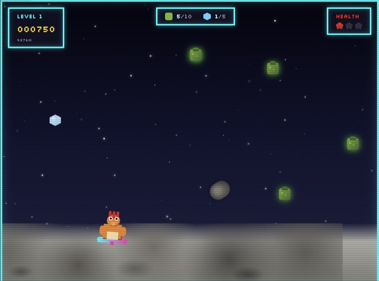
An infinite pannable, zoomable board of project cards with an optional 3D depth mode —
explore the real one. Cards come in two behaviors: link cards
(<a>, open the project) and modal cards (<button>,
open an on-page overlay).
View markup
<div class="lab-card">
  <a class="lab-card__inner" href="…" target="_blank" rel="noopener">  <!-- or <button> for modal cards -->
    <div class="lab-card__float">
      <div class="lab-card__thumb"><img src="…" alt="" /></div>
      <div class="lab-card__meta">
        <div class="lab-card__cat">Game</div>
        <div class="lab-card__title">Chicken Joe's Lunar Wipeout</div>
        <div class="lab-card__blurb">8-bit lunar chaos…</div>
        <span class="lab-card__open">Open</span>
      </div>
    </div>
  </a>
</div>
Interaction contract
| Input | Behavior |
|---|---|
| Drag | Pans the world with inertia; a card tap only registers under 8px of total travel, so drags never misfire clicks |
| Wheel / pinch | Zooms about the pointer; on-screen − / + / recenter buttons mirror it for keyboard and touch |
| Tab | Cards are real links/buttons in DOM order — the whole board is keyboard-traversable without panning |
| 3D toggle | Adds perspective depth per card and cursor-driven parallax tilt; on by default, one button to flatten |
| Browser zoom | Never blocked — the viewport meta stays zoomable; canvas gestures are scoped by touch-action on the board only |
Case-study kit#
The parts every case study is assembled from. Each study re-themes the kit through its
[data-case] scope (see case-study accents),
so the same components wear five different brands.
Meta block
View markup
<dl class="case-meta">
  <div class="case-meta__item"><dt>Role</dt><dd>Principal UX Designer</dd></div>
  <div class="case-meta__item"><dt>Timeline</dt><dd>2024 – 2025</dd></div>
</dl>
Point card
Single secure access point
One caregiver identity to manage one or more care recipients — no shared passwords.
Invite, claim & revoke
Care recipients invite caregivers; access can be granted and pulled back at any time.
The rest of the kit
| Part | Job | Notes |
|---|---|---|
case-hero | Title, client mark, intro | Per-case display face via --case-display |
case-impact | Brand-tinted outcomes band | Stats + pull quote on the case accent; text tuned to AA per palette |
case-quote | Stakeholder voice | figure + attribution, same contract as the recommendation card |
case-screens / case-gallery | Product imagery | Brand-tinted mats; every image bordered and captioned |
case-ph | Honest placeholder | Labeled "Asset placeholder" with an icon — never fake screenshots |
case-next | Forward momentum | Every study ends with a link to the next one |
✓ Do
- Lead with the quantified outcome in the impact band.
- Theme via
[data-case]tokens — never hand-color components. - Caption every artifact with what it shows and why it mattered.
✕ Don't
- Don't ship a case accent that fails AA on small text in either theme.
- Don't fake missing artifacts — use
case-phand say so. - Don't let a study dead-end;
case-nextis not optional.
Password gate#
Confidential case studies sit behind a server-side gate: a Netlify Edge Function
intercepts /work/*, serves this branded card to unauthenticated visitors (HTTP 401 +
noindex), and sets a hashed, HttpOnly cookie on the correct password —
protected pages never reach the browser without it.


Protected work
This case study is private.
These projects contain confidential client work. Enter the password to view the case studies.
That password isn't right — try again.
View markup
<form class="passgate__form" method="POST" action="">
  <input class="passgate__input" type="password" name="password"
         placeholder="Password" aria-label="Password"
         autocomplete="current-password" autofocus />
  <button class="passgate__btn" type="submit">View work</button>
</form>
<p class="passgate__err" role="alert" id="gateErr">__GATE_ERROR__</p>| Guarantee | Mechanism |
|---|---|
| Content never leaks | Edge function gates at the CDN — unauthenticated requests receive the gate HTML, not the study |
| Errors are announced | Server-rendered message lands in a role="alert" element |
| Sessions persist | SHA-256 token cookie, HttpOnly · Secure · SameSite=Lax, 30-day expiry |
| Search stays out | 401 status, x-robots-tag: noindex, and /work/ disallowed in robots.txt |